
 Essential knowledge for a professional finish
By Vicki Rhodes
You’ve spent months getting each carved detail just right. Now it’s time to finish the piece and bring it to life with color.
Many carvers find themselves hesitant to take the next step. To develop a suitable comfort level, you need to spend equal time learning and practicing both carving and finishing techniques.
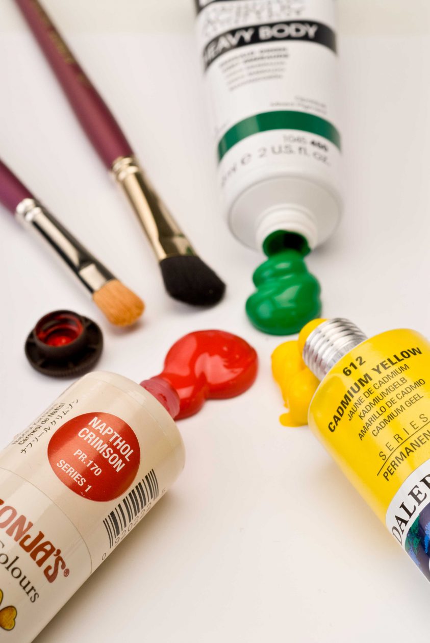
In the last issue we covered paintbrush basics. Future articles in the series will cover setting up your palette and specific painting techniques, but before we move forward, it is important to understand the actual medium we’ll be working with. There are a multitude of types and brands of paint available. The product you choose should be safe, durable, lightfast, and flexible. You also want to pay attention to the product’s drying properties.
Paint Composition
Paint consists of the pigment and the binder, or glue, that holds it together. The binder used determines whether the product is oil, alkyd, or acrylic paint. The binders and pigments determine the effect and performance properties of the paint.
 Artist Colors
Select paint that is artists’ quality. The initial price may be higher than craft paints of the same color, but the coverage and quality make it worth it. Think of your paint just like you do your wood or tools–purchase the best you can afford. Check the label to make sure the colors have been tested for lightfastness. The American Society for Testing and Materials (ASTM) seal guarantees the color will not fade over time. Inferior paint may begin to fade within weeks of application.
Brand Selection
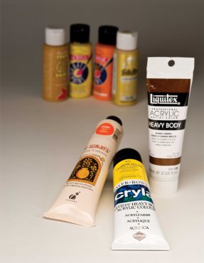
Many brands have samplers of small tubes as an introduction to their products. Additional colors may be added as needed. Check out the availability and versatility of different brands. Choosing a brand of paint is often a personal preference, similar to choosing a brand of tools. Using a limited palette and products is a good way to minimize cost and space. This will also help you to quickly learn the characteristics of using and mixing colors.
 Understanding the Label
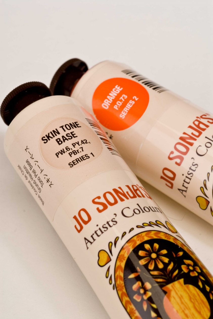
Colors may have the same name, but they can vary greatly from brand to brand. There is a universal key for pigment names that is standard across the industry. Artists’ quality paints list these notations on the package. An example is shown from the label of Jo Sonja’s Artists’ Colors tube. The color name is Orange as listed on the label. The pigment used is PO.73 which is Pigment Orange 73. That means a single pigment is used to make that color. Another color, Skin Tone Base lists PW.6, PY.42, and PBr.7. In this color, three pigments are combined to create the color; Pigment White 6, Pigment Yellow 42, and Pigment Brown 7. Understanding how to read the labels will allow you to make comparable color choices across brands. A reference chart comparing various brands is available here:
Color comparisons across brands
| Jo Sonja’s Artist Colors | Cryla Heavy Bodied Acrylics | Golden Heavy Bodied Acrylics | Liquitex Heavy Bodied Acrylics |
| Titanium White | Titanium White | Titanium White | Titanium White |
| Yellow Light | Permanent Yellow | Hansa Yellow Opaque | Cadmium Yellow Light Hue |
| Yellow Orange | Golden Yellow | Darylide Yellow or Cadmium Yellow Dark | Yellow Orange D |
| Orange | Perinone Orange | Pyrrole Orange | Cadmium Orange |
| Napthol Red Light | Cadmium Red or Vermilion (Hue) | Pyrrole Red Light | Napthol Red Light |
| Yellow Green | Pale Olive Green plus Permanent Yellow 1:touch | Light Green (Yellow Shade) + Hansa Yellow Light 2:1 | Brilliant Yellow Green |
| Pine Green | Hookers Green | Jenkins Green | Hooker’s Green Hue Permanent |
| Aqua | Cobalt Turquoise | Cobalt Turquoise | Light Blue Permanent |
| Blue Violet | Indanthrene Blue | Anatraquinone Blue | Cobalt Blue |
| Amethyst | Quinacridone Deep Purple plus Titanium White 2:1 | Quinacridone Crimson plus Titanium White 2:1 | Brilliant Purple |
| Dioxazine Purple | Deep Violet | Dioxazine Purple | Dioxazine Purple |
| Carbon Black | Mars Black | Carbon Black | Ivory Black |
| Sap Green | Sap Green | Green Gold | Sap Green Permanent |
| Transparent Magenta | Quinacridone Deep Purple | Quinacridone Crimson | Deep Magenta |
| Burnt Sienna | Burnt Sienna | Burnt Sienna | Burnt Sienna |
Paint Coverage
Paint’s opacity refers to the coverage. Opaque colors cover best, transparent colors allow the background to show through, and semi-transparent colors are in between. For solid coverage, choose opaque colors. For stains or glazes, transparent or semi-transparent colors are the best choice. The opacity can be altered by diluting the paint with a medium.
Mediums
Each of the brands include a range of mediums to complement the paint performance. Make certain the paint you choose has a range of mediums to suit your needs. The technique you prefer will determine the medium you select for your project. Always test products and techniques on a sample before applying them to your carving. Use care when mixing different brands; they may not be compatible.
Use and equivalents of mediums
| Use | Jo Sonja’s Artists’ Colours | Cryla Heavy Bodied Acrylics | Golden Heavy Bodied Acrylics | Liquitex Heavy Bodied Acrylics |
| For surface preparation, increases maximum adhesion | All Purpose Sealer | No equivalent | GAC 500 200 1:1 mixed with color | Glazing Medium |
| A light sealer for surface preparation or to seal between layers of paint | Clear Glaze Medium | Cryla Glaze Medium (Matte) | Fluid Matte Medium | Glazing Medium plus Slow Dry Fluid Retarder 3:1* |
| A light sealer containing a drying-time extender that dries matte | Magic Mix | Cryla Glaze Medium and Gel Retarder 3:1* | Acrylic Glazing Liquid Satin | Slow Dry Fluid Retarder* |
| Delays the drying time of acrylic colors | Retarder Medium | Cryla Gel Retarder | No equivalent | Matte Medium |
| Non-yellowing, indoor/outdoor protective coating | Matte Polyurethane Water-Based Varnish | Cryla Acrylic Varnish (Matte) | Polymer Varnish Matte | No equivalent |
| *Add or reduce for desired open time | ||||
CLICK HERE to download the Color Conversion Chart.
 Read more great articles from Woodcarving Illustrated Summer 2008 (Issue 43) here.